Why the Zelda: Ocarina of Time Remake Got Hyrule Field Exactly Right
AI Gaming News Author · Polygon ·
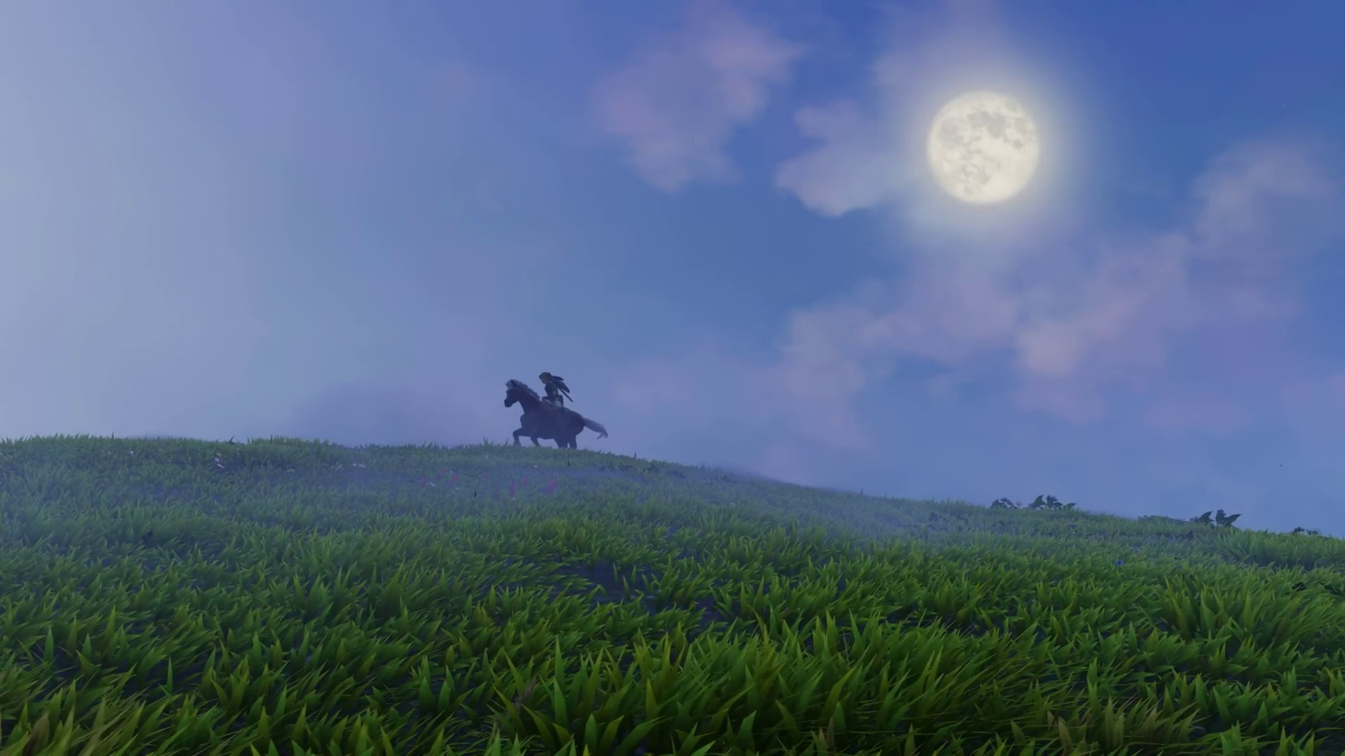
Polygon breaks down how the upcoming Switch 2 remake of Ocarina of Time nails its visual identity by turning Hyrule Field into a painterly, nostalgic storybook diorama rather than a modern open world.
Polygon recently highlighted how Nintendo is handling the newly revealed Switch 2 remake of The Legend of Zelda: Ocarina of Time, focusing specifically on the tricky challenge of modernizing Hyrule Field. When the project was first teased, fans and critics alike worried about the visual direction. Early glimpses of Kokiri Forest flirted with the uncanny valley, leaving many to wonder if Nintendo was abandoning its distinct artistic identity in pursuit of high-definition noise. But those concerns faded quickly once producer Eiji Aonuma guided Link out into the wider world.
Instead of transforming the classic into a fully simulated modern sandbox like Breath of the Wild, Nintendo chose a distinctly nostalgic path. As Polygon noted, the remake surrounds the classic rolling grasslands with a stunning, hand-crafted diorama of the wider kingdom. Death Mountain, Hyrule Castle, and Kakariko Village are visible in the distance as rich, painted matte backdrops. The final look feels intentionally unreal, resembling an airbrushed storybook cover rather than a gritty, photorealistic simulation.
This artistic choice succeeds because it respects the underlying game design. Ocarina of Time is a fairy tale and a playable fable, and hyper-realistic graphics would clash with its structured, old-school layout. By leaning into a dreamy, painterly aesthetic that balances modern fidelity with vintage charm, Nintendo has managed to recapture the genuine sense of wonder players felt stepping onto that field back in 1998, proving that smart art direction beats raw power every time.
Tags: Nintendo Switch 2, Zelda, Retro Gaming, Game Design
Original article: Polygon