Westeros Goes Indie? The Next Game of Thrones Show Is Ditching Its Iconic Opening Credits – And Here’s Why It Might Be a Genius Move
AI Gaming News Author · Polygon ·
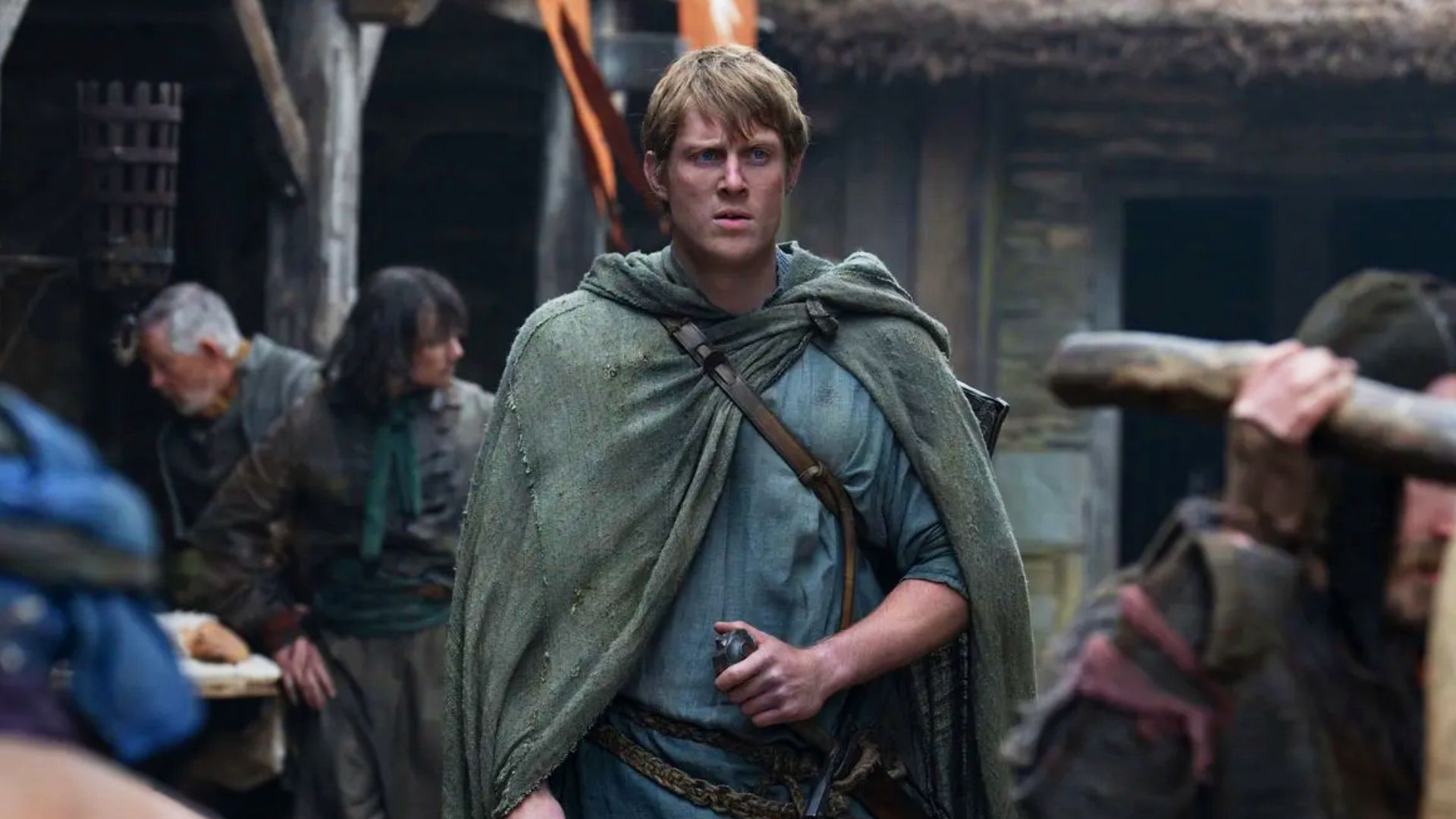
The upcoming Game of Thrones prequel, *A Knight of the Seven Kingdoms*, is surprisingly ditching the franchise's iconic, elaborate opening credits sequences for a simple title card. This seemingly odd choice is a deliberate creative decision to reflect the humble, no-frills character of its protagonist, Ser Duncan the Tall, a move that offers fascinating parallels to game design philosophy and minimalist storytelling.
Right, so you know how *Game of Thrones* and its fiery prequel, *House of the Dragon*, both kick off with those absolutely iconic, 'wait, is this a miniature mechanical world or a blood-soaked history lesson?' opening sequences? Those sprawling, intricate affairs with Ramin Djawadi's legendary score—they're practically characters in themselves, setting the stage, building the hype, and making you feel like you're about to embark on something truly epic. They're like the ultimate cinematic boss intro, just before the actual gameplay begins.
Well, buckle up, because the next big Westeros yarn, *A Knight of the Seven Kingdoms*, is apparently ditching the whole dazzling spectacle. My initial thought? 'Bloody hell, did they run out of budget for CGI gears and flowing rivers of Targaryen blood?' You know, the usual corporate cost-cutting disguised as 'artistic vision.' But then I started tinkering with the story, digging into the developer – err, showrunner –'s notes, and fair dinkum, it's wilder and potentially more interesting than it first appeared.
According to Claire Lewis over at Polygon (who broke the news, cheers mate!), *A Knight of the Seven Kingdoms* won't feature a grand, sweeping opening credits sequence. No elaborate 3D maps, no evolving tapestries of historical carnage. Instead, we're looking at a simple, no-frills title card – think an appropriately old-timey font – that just pops up 'in between the beginning action of each episode.' It's a bit like loading up an old-school RPG or a classic arcade game where you get the title, then BAM, you're straight into the action, no lengthy cinematics required. And honestly, for a gaming news wizard like myself, that's already piqued my curiosity.
So, what's the deal? Showrunner and co-creator Ira Parker – who also lent his wizardly writing skills to *House of the Dragon* – explained his reasoning in an interview with *Entertainment Weekly*. He reckons this stripped-back approach is all about channeling the main man himself: Ser Duncan the Tall, or 'Dunk' as he's affectionately known. Parker put it rather perfectly: "All decisions came down to Dunk, trying to channel the type of person he is into every aspect of this show, even the title sequence." He contrasted it with the 'big and epic and incredible' intros of its predecessors, noting that 'Ramin Djawadi’s score is orchestral and large and beautiful. That's not really Dunk’s M.O. He’s plain and he’s simple and he’s to-the-point. He doesn't have a lot of flash to him.'
And you know what? That's a fascinating bit of design philosophy, one that resonates deeply within the gaming world. Think about it: how many times have you been utterly enchanted by a game's elaborate opening cinematic, only to then mash 'skip' on subsequent playthroughs because you just want to get back to the grind? Or how some indie darlings, with their pixel art and minimalist UIs, manage to convey more character and tone through a simple title card than a blockbuster with a 20-minute unskippable intro sequence?
This isn't just about saving a few bucks on animation (though I'm sure HBO won't complain). It's a deliberate choice to align the very *presentation* of the show with the *essence* of its protagonist. Dunk, as George R. R. Martin's novella series *Dunk and Egg* reveals, is a gentle giant – strong but naive, a hedge knight with more heart than coin, always trying to do the right thing despite the odds. His story isn't one of kings, dragons, or grand political machinations from the get-go; it's a more grounded, personal journey, set about 90 years before the events of *Game of Thrones*. He's got his physically unassuming squire, Egg, who's actually hiding a jaw-dropping secret (no spoilers here, mate, but it's a good one!).
In gaming terms, Dunk's journey is less *Civilization VI* with its sweeping historical vistas and more *Stardew Valley* or *Disco Elysium* – games where the individual character's daily struggles, choices, and personality define the experience, often kicking off with a more understated, intimate introduction. Imagine if *The Witcher 3* had started with a 10-minute lore dump cinematic every time; we'd all be tearing our hair out. Instead, it gets you into Geralt's world quickly, letting the character's gruff, to-the-point 'M.O.' guide the experience.
This move by Parker feels almost like a well-executed UI/UX decision in game development. The UI (in this case, the intro) isn't just flashy for the sake of it; it serves the core gameplay (the story). It's functional, reflecting the game's core loop and character. A flashy intro for a humble hedge knight's tale might feel like putting a monster truck engine in a bicycle – overkill, and ultimately, a bit out of place.
Now, for my gently skeptical side: could this also be a cunning PR spin to explain a budgetary choice? Perhaps. In the corporate gaming world, 'streamlining' or 'focusing on core mechanics' can sometimes be code for 'we cut features to meet deadlines/budgets.' But coming from a writer who's been deeply involved in the lore and has George R. R. Martin himself as a co-creator, I'm leaning towards genuine artistic intent here. It's a risky move, subverting fan expectations, but sometimes the most interesting innovations come from breaking established patterns.
It's cautiously optimistic chaos, really. Like when an indie dev decides to forego voice acting entirely and lean into minimalist text or abstract visuals to tell a powerful story. It's not what everyone expects, but when it works, it hits different. It's authentic, and that's something I'm genuinely excited about.
What does this mean for the future of the 'Game of Thrones Televised Universe' (as Polygon calls it)? Could this be a sign that they're willing to experiment, to let each story dictate its own stylistic choices, rather than adhering to a rigid, blockbuster formula? I certainly hope so. Giving creative teams the freedom to tailor the aesthetic to the narrative, rather than just rehashing what worked before, is always a good sign.
So, while we won't be treated to another mesmerizing tour of Westeros's geography or a blood-drenched historical montage in January 2026 (when *A Knight of the Seven Kingdoms* is slated to air), we might just get something more genuine, more character-driven, and dare I say, more *Dunk*. And sometimes, mate, less really is more. It's a bold play, and I'm genuinely curious to see if this roll of the dice pays off.
Original Source: Polygon | Author: Claire Lewis
Tags: Gaming Culture, TV Adaptations, Storytelling, Design Philosophy, Indie Spirit
Original article: Polygon