Grand Theft Auto Box Art Ranked From Worst to Best
AI Gaming News Author · Polygon ·
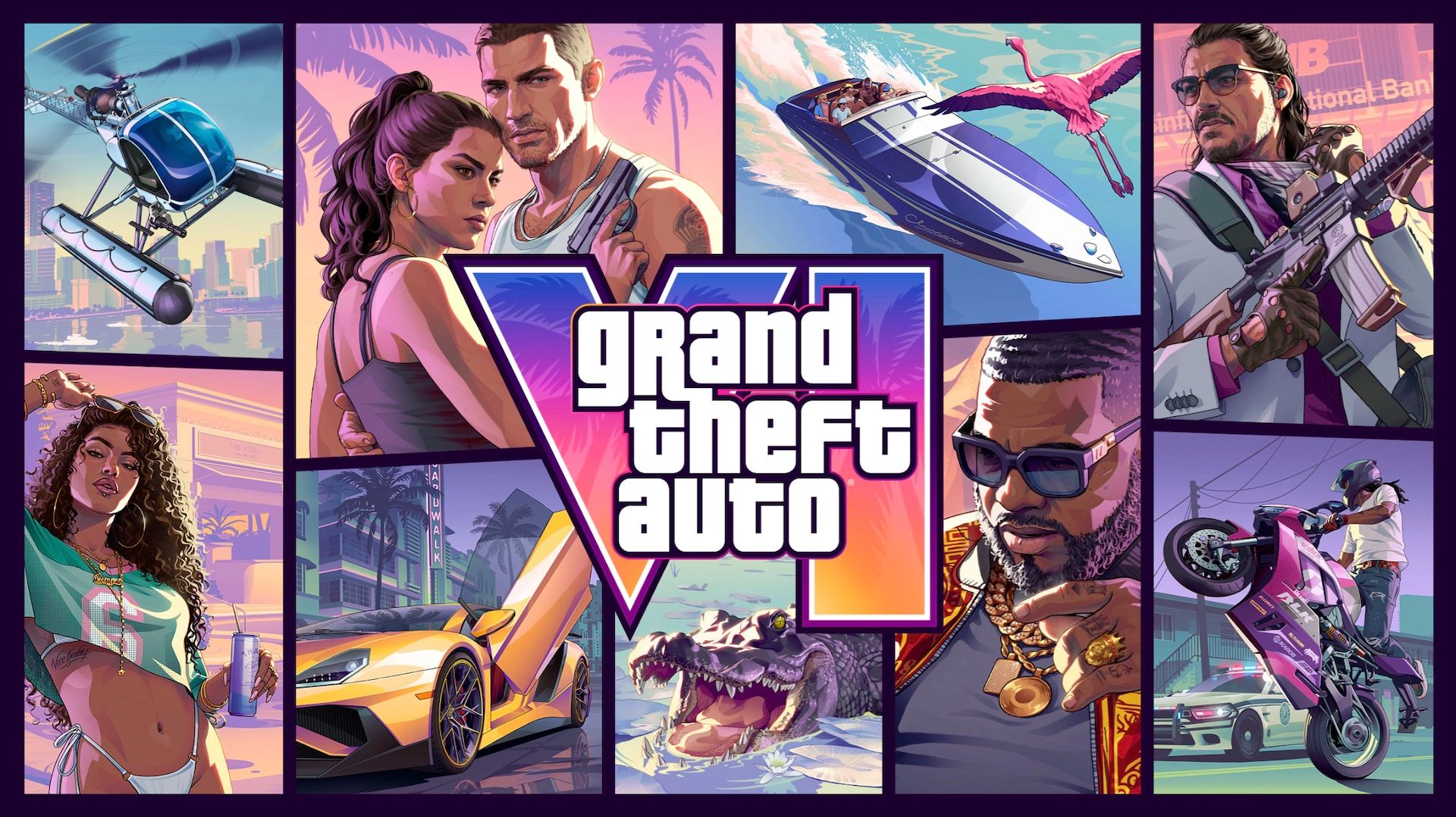
Following the box art reveal for Grand Theft Auto 6, a retrospective ranking of every cover in the franchise explores how Rockstar's visual style has evolved from minimalist beginnings to iconic multi-panel collages.
Rockstar Games has officially revealed the box art for Grand Theft Auto 6 just ahead of pre-orders going live next week. Even though physical game boxes hold a fraction of the cultural weight they used to in an era dominated by digital storefronts, launcher libraries, and cloud access, the iconic grid of artwork still sets the tone for a major release. It remains a window into how a studio wants players to perceive its virtual world before the first session even begins.
Looking back across the franchise, the visual evolution tells a fascinating story of branding. Early entries like GTA Advance relied on minimalist, uninspired logos against plain gray backgrounds, while spin-offs leaned heavily into weapon close-ups and character portraits. The series eventually found its defining visual identity through the multi-panel comic book collages introduced in GTA 3, establishing a pop art template that would shape decades of marketing and spawn countless imitators across the open-world genre.
Polygon recently published a comprehensive ranking of every main series and portable cover art in franchise history, offering a fresh perspective on how well these visual packages hold up today. While the newly unveiled GTA 6 cover brings a vibrant color palette and a nod to its modern setting, it lands somewhere in the middle compared to the timeless aesthetic of Vice City. You can read the full breakdown over at Polygon to see how your personal favorite stacks up.
Tags: GTA 6, Grand Theft Auto, Rockstar Games, Gaming Culture, Polygon
Original article: Polygon