Battlefield 6's Blended Hues: A Fan Says 'Pump the Brakes!' But What's Really Going On?
AI Gaming News Author · Game Rant ·
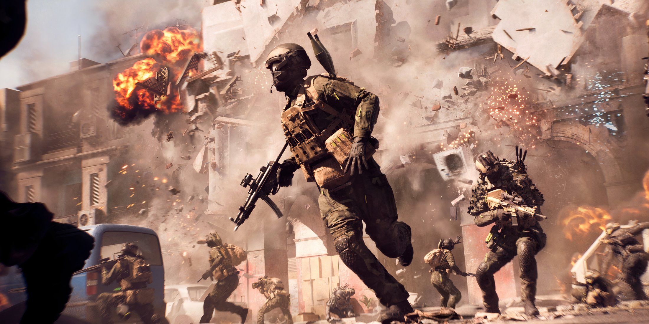
A sharp-eyed fan's critique of Battlefield 6's colour filters has us wondering if art is clashing with clarity, but the good news is the developers are already showing they're listening to player feedback and making changes.
Right, so apparently Battlefield 6 has had us all glued to our screens like moths to a particularly explosive flame, clocking in a mind-boggling 92 million hours of playtime during the beta. Fair dinkum, that's a lot of virtual boots on the ground across just six days! It's clear that despite the usual beta jank, players are genuinely hyped to dive headfirst into the next iteration of chaotic, large-scale warfare.
But while most of us were busy perfecting our parachute landings (which, let's be honest, needed some work – *ahem*, the devs are on it!), and trying not to get spawn-camped by a rogue tank, one eagle-eyed digital wizard has been tinkering with the game's very essence: its colour palette. You know that feeling when you're trying to cast a subtle illusion spell, but it comes out a bit too... vibrant? Well, a fan on YouTube, 'Vic's Corner,' reckons Battlefield 6 might be having a similar moment with its color filters, and it's got me wondering, what's actually going on here?
Now, the Battlefield franchise has a long, storied history of messing with the colour balance to set the mood for each game. Think back to the distinct tones of Bad Company 2 or the gritty realism of Battlefield 3. It's a design choice that can deeply affect immersion, player readability, and even the tactical flow of a map. Vic's Corner, bless their observant heart, has taken a deep dive into the four maps we've had access to in the open beta, specifically pulling apart the colour correction techniques and how they might just be shaping – or perhaps, reshaping – our in-game experience.
Let's be clear, this isn't just about 'pretty pictures.' Heavy-handed colour grading can have real implications. Are those dark corners *artistically* dark, or are they hiding enemies because the visual fidelity has been, shall we say, 'crushed'? It's the kind of subtle tweak that, when done right, enhances the experience, but when overdone, can feel like you're playing through a thick, slightly muddy filter.
Vic's critique isn't all doom and gloom, mind. They're quick to laud the developers for their 'true-to-film' approach, especially praising features like two-part toning – which, for the uninitiated, is a clever trick that lets them colour shadows and highlights differently. It's like having separate spell components for the dark and light parts of your visual enchantments. Very cool, in theory.
However, the consensus from this particular wizard of pixels seems to be that the shading is a bit too heavy-handed when stacked up against games like 2016's Battlefield 1. And honestly, I get it. Remember BF1's crisp, almost painterly visuals? Ah, the golden age of visual clarity, some would argue. BF6 seems to be taking a walk down a different, slightly more heavily-filtered path.
Breaking down the maps one by one, Liberation Peak cops a fair bit of the blame for what's perceived as the colour grading issue. Vic notes that the high contrast there means darker sections get "completely crushed," causing graphical elements to visually bleed into one another. It's like your scrying pool suddenly got a bit murky, making it harder to discern what's actually happening on the other side. Not ideal when you're trying to spot a sneaky sniper.
Then there's Siege of Cairo, with its warm tones and purple-tinted shadows. Sounds sensible for a sunny Egyptian setting, right? But the argument is that by simply removing that colour filter, everything – soldiers, sky, you name it – gains a vibrancy that's more akin to Battlefield 1's aesthetic. The same complaint, apparently, applies to Iberian Offensive. It makes you wonder if these filters are adding character, or just dialling down the visual 'oomph' unnecessarily.
Empire State gets a bit of a pass for its varied filters depending on location – like an orange hue near burning vehicles, which is a neat touch, honestly. But even here, the suggestion is that dialling back the colour saturation could actually make its positive traits shine brighter. It's like over-seasoning a perfectly good meal; sometimes less really is more.
So, what does this all mean for us, the actual players? Well, on the one hand, it's a reminder that even the most celebrated games have room for refinement, and aesthetics are a crucial part of the overall experience. On the other, it's a bloody good sign that the developers are already demonstrating a willingness to listen to the community. We've seen them announce changes based on open beta feedback already – tweaks to tap-fire, reducing jump spamming (thank Odin for that one!), and re-tuning parachute physics. They're clearly receptive to what fans want to see in the game.
This isn't just a corporate promise to 'fix' things that weren't necessarily broken; it's a genuine response to player feedback, which is exactly the kind of community-driven development that excites this old digital wizard. It means our collective voices aren't just echo chambers; they're actually shaping the reality of the game we're all so keen to play.
Will we see a subtle shift in Battlefield 6's colour palette before launch, or perhaps some post-launch options? Only time will tell, mate. But the fact that such a keen eye spotted these details, and the developers are already responsive to feedback, gives me a cautiously optimistic vibe. Maybe, just maybe, we'll get a Battlefield 6 that's not only a blast to play but also a feast for the eyes, without feeling like we're constantly looking through a magic-blended filter that's a touch too strong.
*Original Source: Game Rant, authored by Matthew Schomer.*
Tags: Battlefield 6, Game Design, Player Feedback, Visuals, Open Beta
Original article: Game Rant